American Heritage: Arts + Crafts Revival

Step into the captivating realm of Color Montage Board "American Heritage: Arts + Crafts Revival," where the intersection of tradition, contemporary flair, and the decorative unfolds in a celebration of craftsmanship, authenticity, and the enchanting landscapes of America's Southwest. Amid the revival of age-old traditions, included is a wink to iconic cinematic glamour to further infuse vintage sophistication and a twist of star power into this artisanal movement.

More than a passing trend, this nostalgic revival is a dedicated commitment to preserving regional heritage, nurturing artisan values, and skillfully crafting spaces (and goods) that echo tales of timeless elegance with handmade workmanship. Each brushstroke, each stitch, and every object within becomes a reflection of the enduring allure woven into the fabric of this warm yesterday-year movement.

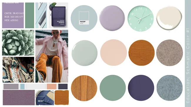
This Color Montage invites you to explore a rich earthen tapestry of featured hues of: golden grasses, mesquite coppers, cognac saddles, amber wheats, desert dusty mauves, subdued peaches, linen ecru's, and sun-kissed creams.

It's a symphony of colors for color enthusiasts. Enjoy!

#artsandcrafts #heritage #authenticity #design #interiors #colorenthusiasts #littleFISHthinktank

A Repost: Nailed the Color Forecasting 3 yrs Early!

Vio-la! Arizona Sunset Dreaming

Tara Rae Hill, ASID

November 30, 2020

Do you hear it? Cece Peniston's “Finally it’s happened to me… and I just cannot hide it.” As we orbit further into a life of purple-y based cosmos and inner reflection hues, Color Montage "Vio-la! Arizona Sunset Dreaming" explores a medley of violeaciousness in a split complementary partnering of optimistic yellow-orange sherbets. We often over look oranges in palette arrangements due to their high expression. However for year 2020, like many aspects, last year's earthen color forecasts have been interrupted. There is a shift towards more color liveliness and out-of-the-ordinary arrangements (yes!). For ORANGES, especially when yellow leaning, they aide in feelings of vibrance, joy, cheerfulness, positivity -- and bring forth your BEST in creativity. I elected to keep this board with expressive saturated orange sherbets, but for a softer feel, just "value shift" to pastels and muted versions. Presto!

#color #design #colorenthusiasts #interiors #littlefishthinktank #tararaehill

Peach Fuzz Feminine, Floral, + Fauna

Stepping into 2024, Pantone's Peach Fuzz and Benjamin Moore's Blue Nova are stealing the show as trending colors. Being complementary colors, they also form a dynamic duo (which, we do not often see this in COY's)

Fellow designers in interior, apparel, and graphics, are asking how to rock these colors in their specific markets. My go-to advice? Treat these shades as inspirational starting points -- as you have the power to tweak their chromas and values to fit your design needs. Imagine Peach Fuzz shifting towards a deeper russet tawny, a pastel sherbet, or kissing near a soft tangerine color. Or, Blue Nova taken to an expressive cosmic indigo or a mid-shade periwinkle denim color. So, whether you're designing children's seasonal apparel or a hard-built dialysis center, these hues can SHIFT and adapt.

And the best part? Both hues play well with other colors, making them a joy to mix n' match to achieving highly layered fusion palettes.

With this I've leveraged my joys of AI alongside my love of feminine, floral, and fauna elements to create a series of dimensional palettes that show these color interplays.

Enjoy color enthusiasts!

#colorenthusiasts #color #design #interiors #graphics #apparel #peachfuzz #bluenova #pantone #benjaminmoore #coys2024 #littlefishthinktank

Grounded Earthens

Year 2021, a hopeful new frontier. After weathering a year of uncertainty and unrest, we crave comfort and stability as we also seek joy, adventure, and life's simple indulgences (even if from only our homes and streaming shows!). Color will play a critical role this year with "life + human" unlike seen before -- as palettes will range the gamut from imbued pastels, to energetic brights, grounding earthens, and techno super chromatics.

Today's inspirations take us to our secure and familair natural roots with celebrations of chalky Denims, Terracotta + Red Rusts, Canyon Sands, Warm Taupes, + Cool Herbal Green.

ENJOY Color enthusiasts!
#color #design #interiors #architectural #fashion #trending#littleFISHthinktank

Web_Color-Montage-Boards_Grounded-Earthens.jpg

"Cheer Up Buttercups" Lively Lemons

In homage to Pantone's 2021 COY "Illuminating," is Color Montage Board "'Cheer Up Buttercups' Lively Lemons."

A primary hue, Yellow is a dominant color. In its purist form it is the most visible, intense of all hues. Its radiating sunny disposition can help relieve dull-drums, provide levity, and increase focus. However, if experienced with endurance and large swaths, high chromatic yellows can quickly produce eye-fatigue and agitation. Consider proportional restraint when applying in spatial volumes, OR if wanting a color bath, adjusting lemon's sharpness with value shifts to pastel tapiocas, expressive meringues, or moody golds. Any-whoooo -- enjoy!

#coloroftheyear #interiordesign #trending #color #pantone #yellow #illuminating

Web_Color-Montage-Board_Levity-Lemon-Lusciousness.jpg

Vio-la! Arizona Sunset Dreaming

Do you hear it? Cece Peniston's “Finally it’s happened to me… and I just cannot hide it.” As we orbit further into a life of purple-y based cosmos and inner reflection hues, Color Montage "Vio-la! Arizona Sunset Dreaming" explores a medley of violeaciousness in a split complementary partnering of optimistic yellow-orange sherbets. We often over look oranges in palette arrangements due to their high expression. However for year 2020, like many aspects, last year's earthen color forecasts have been interrupted. There is a shift towards more color liveliness and out-of-the-ordinary arrangements (yes!). For ORANGES, especially when yellow leaning, they aide in feelings of vibrance, joy, cheerfulness, positivity -- and bring forth your BEST in creativity. I elected to keep this board with expressive saturated orange sherbets, but for a softer feel, just "value shift" to pastels and muted versions. Presto!

0_Color Montage Boards_Sherbert Lilac Lavender.jpg

Bouquet of Color Delight

A “Bouquet of Color Delight." As we further push into the 4th industrial revolution, blitz advance with new innovations, launch advanced rockets and spacecraft, and also, look inward to personal health and spirituality, Year 2020 has continued a shift towards purple-based hues (warm and cool): marsala, amethyst, lilac, lavender, and periwinkles. As we enjoy these hues, we are expressing them in all values from wispy tints to expressive saturations. To visually balance and modernize, these mystic hues mix well with dusky desert tawnies, muted peaches, french blues, and deep lagoons. Enjoy color enthusiasts!

0_Color Montage Boards_Indigo Marsala Mauve.jpg

Mood Board for Youth Groups

Developing color, materials, spacial design for a leading Higher Education furniture manufacturer’s 3D media deliverables, an explorative palette for today’s fusion student groups. A bouquet mix of colors inspired by Scandanavian mutes and Eastern pop hues, dark shades, and hue-centric street footwear.

Web_Kwalu_Small-Wait_Palette-+-Materials-2.jpg
Web_Kwalu_dorm_hub_large_04.jpg

Mood Board for Youth Groups

Developing color, materials, spacial design for a leading Higher Education furniture manufacturer’s 3D media deliverables, Tara Rae explores an expressive color mix that voices today’s youth-groups trending towards a love of mysticism, radical self expression, gender ambiguities, and our advancements towards space explorations. 1 - 2 - 3 takeoff!

Web_Kwalu_EDU_Sch-2.jpg
Web_Kwalu_library_final-r2-2_CROPPED_900_2.jpg

Wonderland Tints + Tones

"Wonderland Tints + Tones" are "almost whites." They are super tints of Winter Peaches, Copper Blushes, Frenchy Blues, Atmospheric Lilacs and Simply Whites.. Lovely when partnered, RIGHT? These super soft, cloud-like, chalky pastels are inspired by romanticism, the rise of the "power female," and nostalgia of yesteryear.  To quickly modernize this palette mix with Jet Blacks and Optic Whites. ENJOYYYY my friends!

Color Montage Board_Wonderland 1.jpg

The Poppy Naturalist, Living Life!

So many trends are tracking today. Making "snippet reporting" tough.  With 10 years+ of stagnation with financial inequalities, broken trust with governments/corporations, and societal clashes, today's trends mostly point towards a NEED for a "Love of Life." And, this being pursued with u-n-a-p-o-l-o-g-e-t-i-c free thinking and amplified personal expression. This embrace of living (so, good and the bad), encompasses our desires for personal expression, internal fortitude, connections to nature, needed escapisms, spiritual transcendence, and even revolution (if warranted). How we EACH express our Love of Life is absolutely infinite with today's lifestyle actions, design, and color palettes.  Currently, I am working with a Client who shares a common appreciation for the 19th century Naturalists and their Love of Life. Their flora + fauna, scientific recordings, art, color + light, and respites. We are transforming her family's new home into a Modern Naturalist Wonderland for child and adult dwellers (and, celebrate nostalgic era's: Art Deco, Beaux Arts, Mid Century, and Chinoiseries). An early Concept Mood Board to convey feel and palette (not final selections)....  #LoveLife #Naturalists #color #trending #tararaehill #LittleFISHthinktank

Color Montage Boards_The Poppy Naturalist.jpg

Soft Earthen Tints n' Tones

Inspired by soft, ethereal earthen tints n’ tones. Today we look to wellness, nature, simplicity, and a freedom from clutter and chaos. Many us are being drawn to soft sands, lushy forests, wispy skies, chalky sea shells and the color palettes, textures, textiles, and potteries that best express these retreats.

#SherwinWilliams #BehrPaint #color #trending #interiors #tararaehill #LittleFISHthinktank

0_Color-Montage_Earthens-and-Pine.jpg

Opposites Do Attract

Who says opposites do not attract? Enjoy "Opposites Attract: Dramatic Eclecticism" Color Montage Board. This mood board is inspired by a high fusion of divergent color, period styles, geometries + organics, hard + soft surfaces, and high glosses to mattes.

You can be cool and spicy, vintage and modern, high hip and sensually sophisticated all IN ONE;0)

#SherwinWilliams #BehrPaint #color #trending #interiors #tararaehill #LittleFISHthinktank

Color Montage Board_Opposites Attract.jpg

The Raw Naturalist

We continue to appreciate, from egalitarian to luxe products, the genuineness of our earthen world, the love built into hand craft creations, + "touchy-touch" authentic raw materialities. As we head into our 4th industrial revolution (hyper tech), we still romanticize yester-year's "The Naturalists." That is, the artisans, scientists, their sketches, and color documentations of flora + fauna). 
#Naturalists #color #trending #tararaehill #LittleFISHthinktank

Color Montage Board_The Raw Naturalist.jpg

Paprika + Tabascos

Ready to sizzle? As we turn to appreciating Chinoiserie + Cinematic Reds this season also look to heated, earthen, spicy Paprikas + Tabasco's (Cinnamons too). These hues, seated between orange and red, make perfect complements for putty peaches, raw taupes, muted blushes, parchments - and also jewel-tone sapphires, emeralds, and  lively teals. Enjoy! #color # trending #Interiors #tararaehill #LittleFISH #pepper #paprika #tabasco

Color Montage Boards_Paprika + Tabascos.jpg

Modern Herbals

Who is loving on greens right now? With increased wanting's of escapism, soothing environments, romanticisms of yester-year - PLUS simple luxuries and a drive towards more modernity ... Greens are the "it" colors.  Color Montage Board "Modern Herbal" is a celebration of Herbal, Lichen, + Celadon greens.  They make PERFECT color pairing with trending Copper Blushs, Confident Blues, Bold Blacks, + Seductive Lilacs.  

Color Montage Board_Celadons + Eucalyptus Greens.jpg

Everlasting, Cooling Oceanics

As a perrrrfect complement to the "Peppery Paprikas + Tabascos" Color Board (last color board) are these "Everlasting, Cooling Oceanic's".  We've seen deeply saturated Blue-Greens from Blue-Tinged Emeralds, to Turquoise Caribbean's, and Jewel Toned Teals steal our hearts for 2017 and into 2018.  Including Sherwin Williams scrumptious 2018 COY Oceanside (which a LittleFISH residential Client has fallen madly in love with). As we search for calm from our chaos, escapist tuck-aways, with connections to healing nature, and throw-backs to vintage Art Nouveau and Deco designs we welcome all vibrant to rich jewel tones --  with Oceanic's being our favorites.  #LittleFISHthinktank #tararaehill #trending #color #interiors #fashion #SherwinWilliams #Oceanside #teal #caribbean #turquoise #green

Color Montage Boards_Oceanic Teals..jpg

Wonderland Tints + Tones

Super tints of Confectionary colors this Color Montage displays interior applications of these misty, atmospheric pastel colors. They feel like a dreamlike watercolor streetscape, eh? These ethereal colors are often chalky and are trending in apparel, cosmetics, food, and European automotive brands.

Color Montage Board_Wonderland 2.jpg

Living Color: Mix it! Mix it!

Inspired by 2017 Paris Fashion Week's "Haute Couture" Runways.  We are living in times with the mixes of color are more then "ever before." Even for commercial interiors that are human centric and/or wellness focused, the genesis of palette preferences are often influenced by our love of fashion and style. These colors are a reflection of our love of wanderlust (literally or virtually), the celebration of the female (and by doing so ironically pushing the boundaries of "what IS gender"), and are reminiscent of romantic vintage days.

Color Montage Board_Color Mixing.jpg

Wonderland Tints + Shimmers

As many continue to yearn for quieter, less chaotic simpler days, as the rise of the female propels, and we are reconsidering concepts of luxury, many for 2018-2019 will further embrace soft, amorous muted tints.  These are slight slips, whispers of color.  Often muted, incredibly subtle, and understated. Initially, you may think you are viewing a white, beige, or grey only to be pleasantly surprised it's a color! Depending on their materiality they can feel egalitarian (matte chalky pottery) to full on posh (metallic velvets). These faint Wonderland Tints range from powder and beach glass blues, to putty peaches, taupe blushes, golden beiges, and misty heathers. They partner perfectly with smoked glass and bronze metals.

Color Montage Boards_Wonderland Tints + Shimmers.jpg